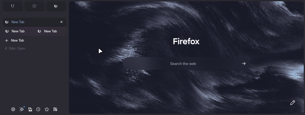
Tab Settings
Theme settings are accessible via the
about:configpage. Typeultimaoruser.themeto get started.
ultima.tabs.tabbar.disabled & ultima.tabs.tabbar.autohide
Both of these settings work for horizontal or vertical tabs, expandOnHover should be OFF when using vertical tabs
- ultima.tabs.tabbar.disabled -> will completely hide the tab bar
- ultima.tabs.tabbar.autohide -> will completely hide the tab bar within the edge of the screen
ultima.tabs.tabbar.autohide+compact
With both ultima.tabs.tabbar.autohide and ultima.tabs.tabbar.autohide+compact enabled, the tabs container shrinks into a compact Zen Style.
ultima.tabs.horizontal.under.navbar
When using horizontal tabs, toggle between tabs on top, or tabs under the urlbar

ultima.tabs.horizontal.fullwidth
Horizontal tabs take up as much width as possible
ultima.tabs.closetabbutton.on.icon
Hovering over a tabs icon will present the "close tab" button
ultima.tabs.tabCounter
Display a counter/indicator for the total amount of tabs open in the container
ultima.spacing.compact.tabs
This reduces the spacing between vertical tabs, letting more tabs fit in-screen
ultima.tabs.disable.scrollbar
This setting hides the scrollbar within the vertical tabs container
ultima.tabs.disable.update.dot
to hide the update dot that appears on unselected tabs
ultima.tabs.focus.blur
Focus/Hovering over a tab will blur all other tabs
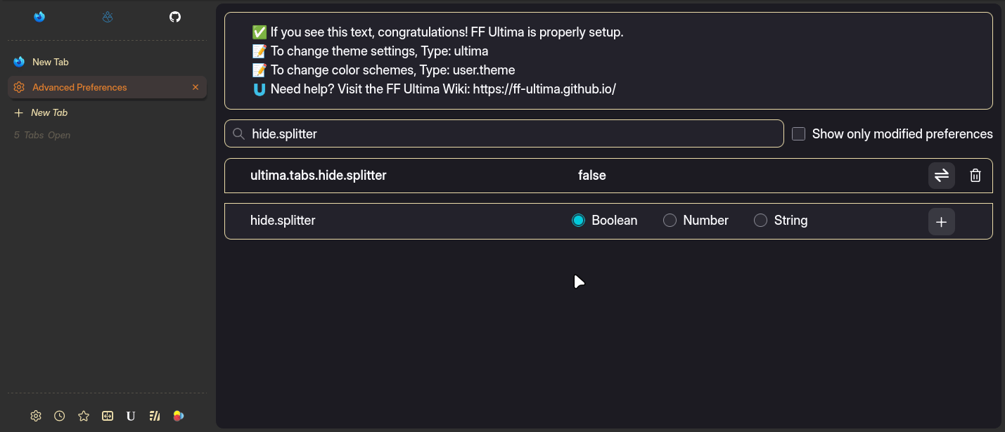
ultima.tabs.hide.splitter
This setting hides the splitter (resizeable bar) until hovered
ultima.tabs.multiline.labels
Tabs can span multiple lines. This setting is a personal favorite. Only works with vertical tabs.
ultima.tabs.not.a.progress.bar
This setting simulates the tab loading strip you see on some websites like youtube, reddit, etc. It works by tracking the loading favicon for the selected (loading) tab. It isn't actually a loading bar but it's consistent.
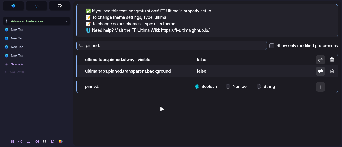
ultima.tabs.pinned.transparent.background
Gives pinned tabs a transparent background style
ultima.tabs.pinned.always.visible
To put it simply, this setting forces the pinned tab container to always show all pinned tabs. Removing the scrolling limit.
ultima.tabs.reverse.content.order
This setting simply reverses the order in which things appear in a tab. Close button first, label second, icon last. Here's an example of it in action, with multiline tabs.
user.theme.xtras.tab.outline.color
You can specify a tab outline color by typing in a color (or gradient). Leave empty for no outline.
ultima.tabs.newtabbutton.ontop
when using with vertical tabs, you can change the positioning of the new tab button with ultima.tabs.newtabbutton.ontop.1 and ultima.tabs.newtabbutton.ontop.2
- at the absolute top of all tabs
- at the top of tabs, under pinned tabs
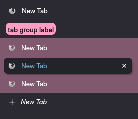
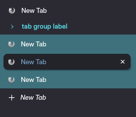
ultima.tabs.tabgroups
Tab groups are styled in two seperate ways. Choose only one label style.
- tabgroups.label.1 is a circular style
- tabgroups.label.2 is a compact pill style label
- tabgroups.label.3 is an arrow dropdown style
Tab group backgrounds are more flexible. They can be used seperately or combined.
- tabgroups.background.1 is a full tab group colored background
- tabgroups.background.2 is an animated gradient background
- tabgroups.background.3 is the default tab group line background
- tabgroups.background.4 seperates the tabs in a dotted border
ultima.xstyle.containertabs
You can choose one style for container tabs with: ultima.xstyle.containertabs.i (i, ii, iii)
ultima.tabs.tabbar.hide.buttonstrip
This setting will hide the vertical tabs bar button strip until hovered
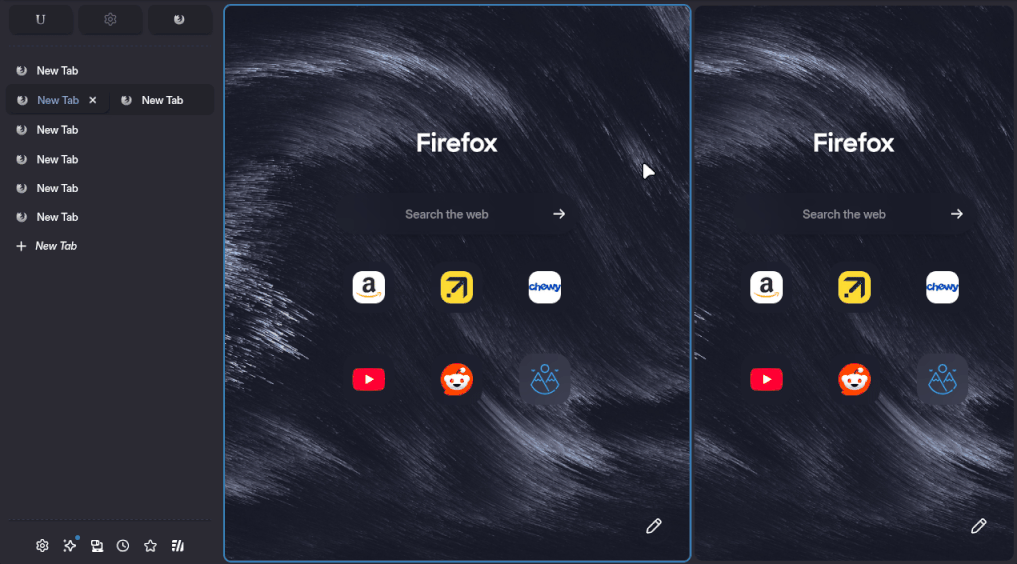
ultima.tabs.splitview.content.outline
By default when using split view, the focused tab is surrounded by a border outline, this setting lets you toggle it on or off
ultima.tabs.splitview.focus.opacity
When using split view, the view that is not in focus fades out in opacity (becomes less visible)
ultima.tabs.splitview.focus.shrink
When using split view, the second view (when not focused) shrinks down to 30% of the windows width (portrait size)
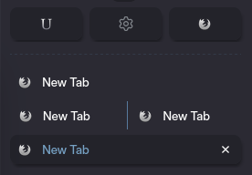
ultima.tabs.splitview.tab.seperator
By default when using split view, the combined tabs in the tab container have a visible seperator line, this setting lets you toggle it on or off
ultima.tabs.splitview.tab.gradient
This setting changes the combined tabs background color to a subtle gradient